Choosing a hue can become a way to postpone deciding where a composition should gather. These two original digital studies remove that choice for a moment. Five plain shapes keep their identities, sizes and assigned grays while their positions change. One map distributes them across the field; the other brings them closer into an uneven group. They are schematic comparisons, not painted samples, printed proofs or evidence that a particular arrangement controls everyone’s attention.
Assign the roles before moving anything
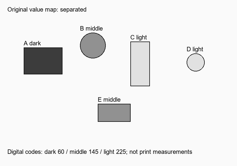
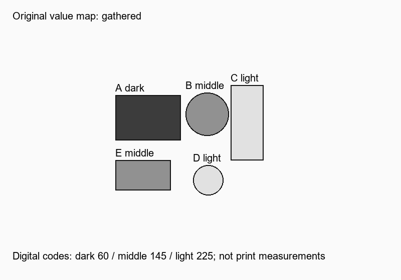
The five shapes are labeled A through E so that their identity can be followed between maps. A is the broad dark rectangle. B is a middle-gray circle. C is a tall light rectangle, D a smaller light circle and E a horizontal middle-gray rectangle. The background is lighter than all five. Thin outlines and labels identify the forms; they are not additional objects within the five-shape exercise.
The assigned digital gray codes are 60 for dark, 145 for middle and 225 for light, with a background code of 250. Each uses equal red, green and blue channel numbers. These are declared image values rather than measured reflectance or a promise of exact brightness on another screen. Getty distinguishes value from hue; this exercise uses that distinction without attaching a mood or cultural meaning to a gray.
Map one: give each shape its own interval
In the separated map, A sits toward the upper left, B above the center-left, C farther right and D near the right edge. E occupies a lower position below the middle. Each shape has a substantial interval around it, and none overlaps another. I read the collection as several distinct stops rather than one compact cluster.
The dark rectangle gives the left side a strong mark, but E introduces a separate lower event. My first question is whether I want that lower rectangle to remain so independent. It is not automatically an error to leave it there. A composition intended to keep several items distinct might value the spread; one intended as a compact emblem might find the same distribution less useful.
Because the shapes retain recognizable labels, the map is more than a vague suggestion to simplify a palette. It makes one concrete relationship available for discussion: how far the lower middle-gray rectangle sits from the dark rectangle and its neighboring circle. A future change can address that distance without first replacing a color.
Map two: gather without making a solid block
The gathered map brings A toward the middle-left and places B just to its right. C remains an upright light shape farther right; D sits below the circle area, and E moves beneath A. Small background intervals remain between the forms. No shape is resized, recolored or hidden, and their outlines do not overlap.
I read A and E as a related left-hand pair in this version, with B offering a rounded neighbor and C a taller pale boundary. D introduces a smaller circular return lower down. That reading describes my response to the actual original map, not a test result or a general rule about circles. Another reader might give the pale vertical rectangle more importance.
For a small invented poster mark, I would investigate the gathered version first because its separate elements can be discussed as one uneven group. For a layout where each item needs an independent location, the spread version might be more useful. Those are proposed purposes; neither map has been used in an actual poster or tested at reduced size.
Let the map ask a purchasing question
Before buying paints, colored paper or a digital palette collection, ask which relationship remains unresolved. If the lower rectangle still seems disconnected, a different blue may not answer the distance question. If the pale upright needs another place, change its position in another study while keeping the assignments visible. The point is to make a choice inspectable, not to forbid color.
An eventual hue study would be another stage. Replacing these grays with colors could change the relationships, so this exercise does not prove that any five colors will behave the same way. Actual paper, ink and viewing conditions also need their own assessment if the work is intended for print. Here the useful decision is simply whether you prefer a spread of distinct marks or a closer, uneven gathering before making those later choices.
Sources & further reading
Published sources for the details and examples discussed in this story.