A wraparound cover can look complete as a flat file and lose its title when you consider the front face alone. The problem is not necessarily small lettering. It may be that the designer has treated back, spine and front as one uninterrupted reading surface. Our original NIGHT INDEX mockup compares a title crossing a spine boundary with a revision that gives the front face a complete title of its own. Both are drawings of a proposed cover, not a printed book we have handled.
Read the file as a spread, then as faces
Lulu's custom-cover guidance describes a print-book cover as a single-page PDF containing back, spine and front. Its template depends on the selected paper, binding, size and page count. Those production facts explain why a flat cover file includes surfaces that a front-facing viewer cannot see together.
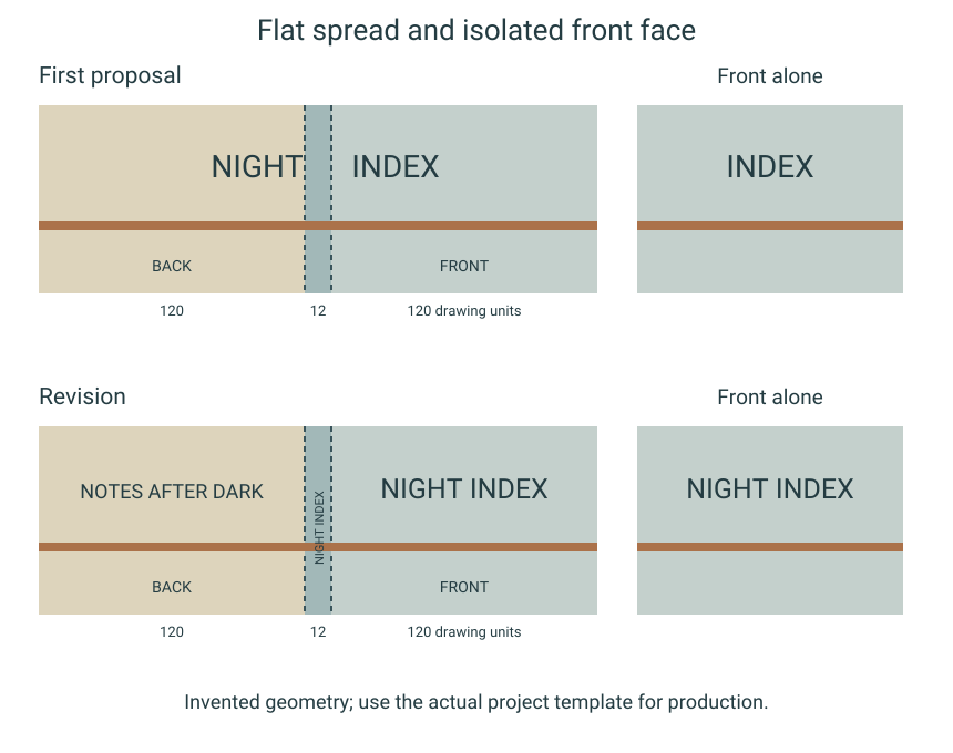
Our drawing uses a deliberately invented geometry: a 120-unit back, a 12-unit spine and a 120-unit front. These are drawing units, not a printer-ready specification or a spine-width calculation. The back is on the left, the spine in the middle and the front on the right. Vertical dashed lines locate the two boundaries so we can discuss which face holds each piece of information.
Start by viewing all 252 units. In the first proposal, the words NIGHT INDEX form one horizontal title that begins in the back panel and continues toward the front. Across the flat spread, the phrase is available. That first reading can make the arrangement feel resolved before the physical division has been considered.
The front face has lost the beginning
Now look only at the right-hand panel in the accompanying front-face diagram. The title's opening word is no longer there. The remaining word can be clearly drawn and still fail to identify the publication as intended. Increasing its size would not restore the absent word; the missing information belongs to another face.
This is the failure I would fix first. A title does not become complete for a front-facing reader because a designer knows what the whole spread says. Nor does a decorative line crossing the spine prove that the words should cross with it. A visual connection and a necessary reading sequence are different design decisions.
The spine is not simply an extra strip of front-cover width. In this mockup, it is its own narrow surface. A person seeing the front face may not have access to the back panel at the same time, so the design should not require that access merely to recover the name. We are comparing the surfaces represented in the drawing, without predicting a measured reader response.
Give each face its own task
In the revision, NIGHT INDEX appears complete inside the front panel. The back carries a separate short line, NOTES AFTER DARK. The spine carries the title as a separately oriented label. A thin color band continues across all three panels, so the wraparound relationship survives even though the essential wording no longer depends on crossing a boundary.
The band is allowed to continue because it is not being asked to supply an absent part of the title. That is the distinction I want the revision to preserve. The front can identify the work; the back can introduce a different piece of copy; the spine can be considered within its own actual usable width.
Our twelve-unit spine is large enough in the schematic to name that task, but it does not establish that a real book will permit spine lettering. Use the actual project's generated template and requirements before selecting a type size or assuming a title fits. A wider-looking mockup cannot make the manufactured spine wider.
Preview the intended object, not just the canvas
Lulu describes its book preview as showing margins, bleed, folds and trim after acceptable files are uploaded. That is a useful later check for the actual project. It does not turn the arbitrary units in our illustration into a production template, and this article has not uploaded a book or reviewed a print proof.
Before preparing a paid print order, inspect the proposed front, back and spine separately as well as together. For each face, ask what information remains complete when the other faces are out of view. Then confirm the actual file requirements and proof the chosen design. The revision is finished editorially when the front can introduce NIGHT INDEX without asking its reader to reconstruct a sentence from around the spine.
Sources & further reading
Published sources for the details and examples discussed in this story.