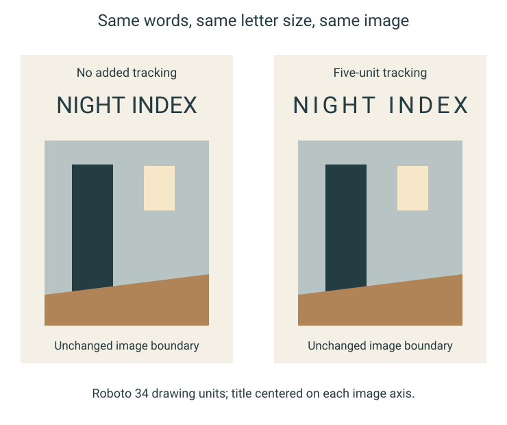
The words can stay the same while a cover begins to speak at a different pace. Our two original NIGHT INDEX studies keep the typeface, letter size, title baseline and underlying image fixed. Only the added space between letters changes. The picture is an authored geometric doorway scene, not a borrowed photograph. Comparing these two drawings makes it possible to choose a relationship between title and image without treating a new phrase or a larger font as the explanation.
Keep the sentence and the scene still
Both studies use the same uppercase NIGHT INDEX in Roboto. The compact version adds no extra tracking; the open version adds five drawing units between successive characters. Both titles are centered on the same cover axis. The unchanged image below contains a dark upright opening, a small pale rectangle and a low ochre plane. The title does not supply a person, an event or a documentary location for those shapes.
Those constants matter. If the second title were also smaller, higher or printed in another color, its new relationship to the scene would have several possible causes. Here the wider line is produced by spacing alone. Its outer letters travel away from the central axis while the image boundary remains in place. The comparison asks what that changed span does in this particular layout.
Getty's formal-analysis guide uses space to describe the area around and within forms. That vocabulary is useful for looking at the intervals in our drawings. The preference below is an interpretation of these authored studies, rather than a reading rule established by Getty for magazine typography.
The compact line behaves like one title object
In the compact version, I first read NIGHT INDEX as a short, dense unit above the doorway scene. The phrase is visually contained well inside the image's width. Its two words remain distinct, but the group does not stretch toward both edges of the picture. That gives the image more of the lateral reach in the upper part of the cover.
I would choose this version for an imagined issue whose image should make the first spatial invitation. The title identifies the publication while leaving the dark opening and the pale rectangle to establish the broader arrangement. Nothing about that choice requires calling the letters louder or more authoritative. The useful observation is their actual footprint relative to the image beneath them.
The risk for this design intention would be making the title so compressed that the word break becomes harder to distinguish. Our study retains the normal space between NIGHT and INDEX; it does not squeeze the words into one name or shrink their letters to create extra empty area.
The open line reaches across the image
With five extra units between characters, the title spans more of the cover. It extends a little beyond the image's side boundaries without changing the drawing below. I read it less as a compact name placed over a picture and more as a horizontal element that belongs to the width of the whole cover.
That broader span creates another relationship with the upright opening. The image asks me to notice a vertical interval; the title extends across a horizontal one. I prefer the resulting tension when the cover brief is to make the title participate in the composition rather than sit quietly above it. This is a reason to choose the open version for this drawing, not a claim that wide spacing makes every title more elegant.
There is also a cost worth keeping visible. The wider word forms ask the eye to connect separated letters across a longer line. At a small reproduction size, inspect whether the phrase still reads as two words rather than a row of detached marks. The drawing alone does not establish that result on every screen or printed stock.
Choose the relationship before changing the words
For this proposed cover, my choice is the open version when the title should answer the image's width, and the compact version when the doorway scene should have that reach to itself. Those are different editorial intentions, even with an identical name and image.
Before ordering a printed run, carry the chosen spacing into the actual cover dimensions and inspect a suitable proof. Preserve the word space, title size and image boundary during that check. Otherwise the production comparison can quietly become a new design, and the original reason for choosing one version will be difficult to evaluate.
Sources & further reading
Published sources for the details and examples discussed in this story.