A cover can give a person room to stand or make their presence fill almost every available edge. That choice changes what the page lets us inspect. It does not tell us how close the photographer actually stood or how the subject felt. For this comparison, we made two simple drawn thumbnails from one original imaginary figure. There was no portrait sitting, interview or real issue called After Hours. The same masthead and title occupy the same top band in both studies.
Begin with the drawing rather than an imagined personality
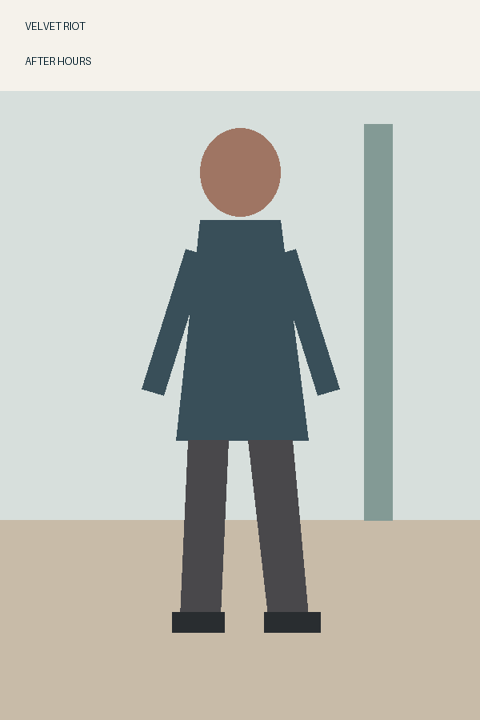
The source drawing contains an oval head without facial features, a dark upper garment, two arms, trousers and shoes. A plain ground meets a pale background, and a narrow upright rectangle stands to the figure’s right. These elementary shapes deliberately leave expression, identity and biography unspecified. Calling the person confident, tired or guarded would add a story the drawing does not supply.
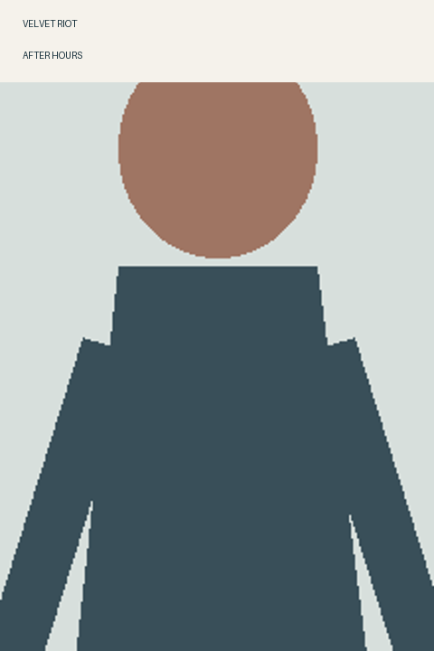
The full version uses the complete source rectangle. The close version takes a narrower rectangle from the same source and enlarges it to the same output dimensions. It does not redraw the pose or add another light. The title band remains fixed, so it covers part of the enlarged head in the close study. That obstruction is visible in the actual study, rather than quietly repaired in our description.
The full figure makes surroundings part of the encounter
In the full version, both shoes remain visible, with ground below and space on either side. The upright background mark is distinct from the body. The reader can move between the figure’s outline, its relation to the ground and the room-like field around it. The composition offers several things to notice before the figure becomes the only available subject.
For an imaginary culture issue about how people occupy places, this version gives the editor useful room. The standing shape can have a relationship with a setting, even though this deliberately sparse drawing identifies no actual venue. A future commissioned photograph would need to establish its own location and permissions; this drawn rectangle supplies neither an interview setting nor evidence that a real person was there.
The crop makes a more insistent presence, at a cost
In the close study, the shoes and ground are gone. The upper garment reaches the lower edge, arms approach the sides and the enlarged head runs into the fixed title band. The formerly separate upright background mark is no longer visible. There are fewer competing spatial relationships: the body’s broad shape has become the main available field.
I read that as a more insistent encounter, but not automatically a more intimate one. The featureless oval cannot offer a meaningful look back. The crop also removes information about how the figure stands. A page can bring a shape nearer while leaving a person less knowable. That is an editorial interpretation of these particular drawings, not a measured response from readers or a general rule that close portraits reveal character.
Choose what the imaginary issue needs to introduce
Getty’s formal-analysis material distinguishes the area occupied by primary objects from the negative space around them. That vocabulary helps name what changes here: the crop gives more of the page to the figure and less to its surroundings. It does not prove that either version is more honest, sells better or creates a particular emotion. Those would be different questions requiring different evidence.
For this proposed After Hours cover, I prefer the full drawing. The space and visible footing let the title suggest a pause after an activity without making the body fight the title band. The close version would interest me for an issue deliberately concerned with interruption or an obstructed encounter. In that case, I would keep the collision intentional rather than claim it was an accidental route to intimacy.
Carry the decision into a real commission carefully
An editor briefing a photographer could ask for enough surrounding space to compare options later, while discussing the intended use and permitted crops with the actual people involved. This feature does not provide a model release or authorize alteration of an existing portrait. Its figure is original and imaginary precisely so that the formal question can be explored without borrowing somebody’s face.
Before paying for a finished layout or print run, inspect the actual image, type placement and agreed use together. A thumbnail decision is useful when it names what should remain visible. Here that means feet, ground and a separate background mark. It should not become an instruction to force every future sitter into an identical composition or attach a fictional personality to a convenient crop.
Sources & further reading
Published sources for the details and examples discussed in this story.