A cover’s edge is part of its argument. An image can appear to continue beyond the page, sit inside a paper margin or acquire a second outline that asks us to notice its containment. We made three original abstract cover studies to compare those possibilities. Each uses the same source composition and the same fixed title, Field Notes. None reproduces an artist’s work, a real issue or a photograph of an exhibition. The differences are invitations to look, not evidence of what an audience preferred.

Give the comparison a shared image
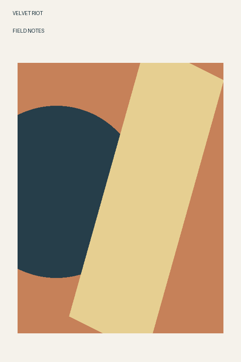
The invented image consists of a rust-colored rectangle, a dark circular shape that extends past its left side and a pale diagonal band. Those shapes were drawn for this exercise. The image is not a crop from a painting, and its marks do not stand for a named artist’s style. That keeps the comparison focused on the cover boundary rather than recognition of an existing work.
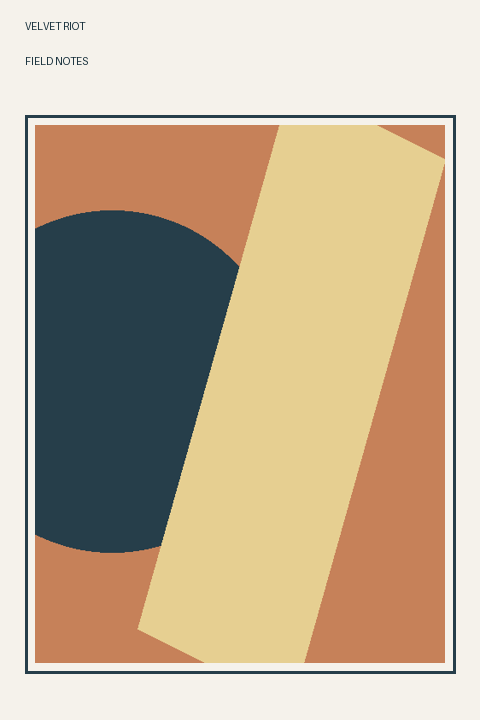
In all three studies, the masthead sits at the upper left and Field Notes remains below it in the same pale title band. The first image fills the area below that band. The second and third reduce the whole source composition proportionally into an inset rectangle, with only ordinary pixel rounding. The third adds a thin dark outline outside the image, separated from it by a small pale gap.
First study: let the image meet the page
The first version has no pale margin beside or below the image. The dark rounded shape is already clipped by the source composition’s left boundary; now that boundary coincides with the page edge. The diagonal band likewise reaches toward the bottom of the page. I read the cover as a field of color that might continue beyond the object I am holding.
That reading is personal, not a claim that the abstract marks literally continue anywhere. The title still has a separate pale band, so even this version does not make every edge continuous. It is useful to name the actual contact: left, right and bottom in the image area. Calling it simply borderless could obscure the clear division that remains above it.
Second study: notice the pale surround
The inset version leaves paper-colored space around the reduced image. Its internal arrangement remains recognizably the same: rounded dark area at the left, pale diagonal crossing rust. But the clipping now happens at an image rectangle inside the page. I can inspect the distance between that rectangle and the cover boundary as another visible relationship.
This is the version that feels most like an image presented as an object to me. The surround gives it a beginning and an end without drawing a second enclosure. The marks have not become more valuable, more authentic or more carefully printed. Those would be claims about something beyond the drawing. The change is the role played by the visible paper-like area.
Third study: an outline can become another subject
The outlined version keeps the same inset image size and position. A dark rectangular line sits outside it, with a pale gap between line and image. The outline repeats the image’s rectangular boundary but does not touch its colored marks. My eye now has two enclosures to compare before returning to the diagonal band.
I find that extra line more assertive than this particular composition needs. It could suit an imaginary issue deliberately about frames, classification or containment, but Field Notes does not require that instruction. This is not a universal objection to ruled borders. Here the line competes with the internal marks for the job of defining what should receive attention.
Choose the boundary before buying a finish
The V&A describes book design across fine bindings, contemporary artists’ books, comics and graphic novels in its National Art Library collection. That broad context is a useful reminder that a publication has an object form as well as images. It does not endorse any of these covers or establish how a printed margin will feel. Our comparison concerns newly drawn thumbnails, not inspected collection objects.
For this proposed issue, I would take the unruled inset version forward. Before paying for actual printing, the chosen dimensions, reproduction permissions and printer’s production requirements would still need checking. The drawing’s page-contact study is not a file prepared to a commercial bleed specification. A margin can make the image feel contained without becoming a claim about binding quality, collectible value or the response of every reader.
Sources & further reading
Published sources for the details and examples discussed in this story.