A repeated shape can give an imagined outfit a clear graphic language. Adding one different shape then becomes a decision about the repetition, rather than a requirement to supply a statement accessory. Three original drawings keep six small circles on the same plain outline and compare no extra mark, a small square and a much larger square. The squares stand for possible accessory accents. Nothing was attached to a garment, and no wearable product was tested.
Establish what the repetition is doing
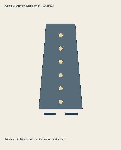
The first drawing places six pale circles in a vertical row on a blue-gray garment-shaped field. The circles have the same size and spacing. Two short dark horizontal marks sit below the field, giving the image another direction without adding a competing repeated decoration.
I read the circles as a sequence: each separate round mark leads to another of the same kind. There is no need to infer buttons, a fastening system or a particular designer. They are drawn circles, and their role is to make the repeated graphic idea available for comparison.
Getty’s design guide discusses pattern, repetition, emphasis and variety as ways of organizing visual elements. That vocabulary supports the question here, but it does not choose an accessory for us. The actual composition has to show what the proposed difference adds.
Small square: make a local interruption
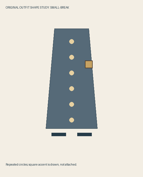
In the second drawing, a small square appears beside the upper-middle part of the circle row, near the right edge of the garment-shaped field. Its warm color relates to the circles, but its four corners introduce a different turn of line. Keeping a related color makes the shape difference easier to discuss without also proposing an unrelated palette.
The square is roughly comparable in scale to an individual circle. I can still follow the six round marks as the established sequence, with the square acting as a local departure. The point is not that a square is inherently more interesting. Its difference becomes legible because the circles have already established something to differ from.
This would be my starting proposal if the brief asked for a small break within a repeated visual language. It does not require the square to carry the whole outfit’s meaning. A real accessory could introduce texture, reflectivity or construction that our flat marks do not describe, so the drawing remains only a shape study.
Large square: change the scale of the argument
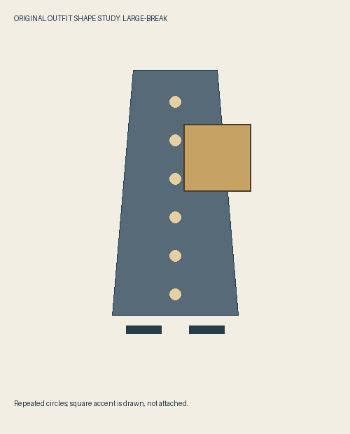
The third drawing puts a much larger square at the same center position. The six circles remain present; the square does not cover them. Instead, its area extends substantially to the right and gives it a more conspicuous separate mass beside their narrow vertical sequence.
I find that the large square now asks for attention as an object in its own right, rather than mainly registering as an interruption within the circle pattern. The image’s question shifts toward the relationship between one broad angular shape and a row of small round ones. That could be a worthwhile composition, but it is no longer the small-break brief I began with.
Reducing the square in this example is a reasoned choice about that brief, not a rule that large accessories overpower every outfit or wearer. An editorial image could intentionally want the larger contrast. The drawing lets us explain the difference without assigning a personality, confidence level or body type to either choice.
Keep or remove the accent for a specific reason
My preference is the small-square version when the repeated circles should remain the main graphic idea. If I wanted the uninterrupted sequence alone, I would return to the first drawing. Removing the square would not make the image unfinished; it would choose continuity over an interruption.
Before shopping, identify the repetition in the actual clothes you intend to wear. If there is no relevant recurring shape, this particular argument may not apply. An accessory described as contrasting does not automatically reproduce the small square’s role. Look at its actual outline, scale, dimensions and intended use instead of buying because a styling example says every outfit needs a final piece.
Practical attachment, weight, comfort and care remain separate questions for the exact item and garment. Our square can sit across a drawn edge without proving that an accessory can be fastened there appropriately. Keep any real purchase within what can be assessed and used suitably, rather than treating a flat picture as a fastening plan.
Sources & further reading
Published sources for the details and examples discussed in this story.